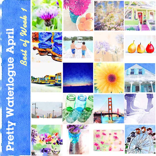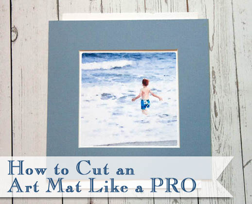
Everyone participating in the #PrettyWaterlogueApril challenge are amazing artists! I had chosen 80 favorite Waterlogue images this week, but force myself to narrow it down to just twenty images. This has been torturous! If you don’t see your image below, please know that it’s not because I didn’t absolutely love your painting. I just had to limit my weekly showcase. Lets check them out – Tips for Better Waterlogue Pictures.
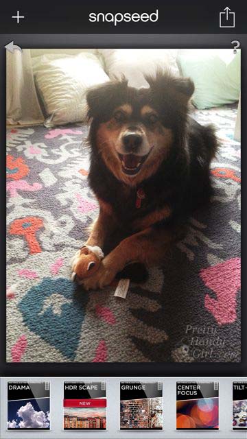
Before we get to this week’s 20 favorites, I wanted to share a few tips for getting better Waterlogue pictures. Besides good composition, I use the photo editing app, SnapSeed to clean up and edit my images.
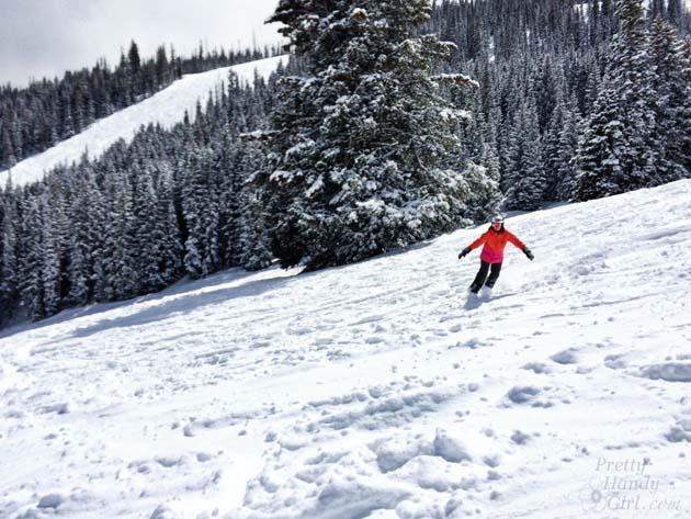
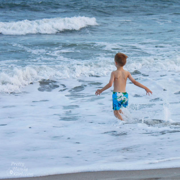
This is the photo right out of my phone after I snapped the picture:
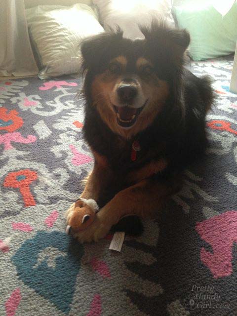
I used SnapSeed to adjust brightness, contrast, saturation and a few more settings. I find using SnapSeed really helps my phone images look a lot better.
Once I bring that edited image into Waterlogue, I play with several of the settings in the Waterlogue app. I’ve found that if you are using an image of animals or people, it really helps to increase the amount of detail shown by choosing Large or Giant (only available for newer iPhones) image size. The larger the size, the more detail Waterlogue retains. You can see in the example below, that Buddy’s eyes are lost in the medium setting. It isn’t until the Giant setting that you see the highlight in his eye, which makes his face more recognizable.
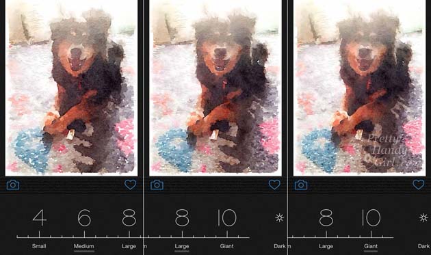
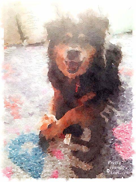
I used the giant setting for my final image because it helped retain the definition in Buddy’s face.
However, there are times that I like a looser painting. For example, landscapes look great when broken down to blocks of color with less definition.
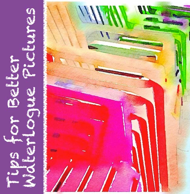
Now, onto my Top 20 #PrettyWaterlogueApril images for Week #2! Read more