Tips for Better Waterlogue Pictures + Best of #PrettyWaterlogueApril Week 2
Everyone participating in the #PrettyWaterlogueApril challenge are amazing artists! I had chosen 80 favorite Waterlogue images this week, but force myself to narrow it down to just twenty images. This has been torturous! If you don’t see your image below, please know that it’s not because I didn’t absolutely love your painting. I just had to limit my weekly showcase. Lets check them out – Tips for Better Waterlogue Pictures.
Before we get to this week’s 20 favorites, I wanted to share a few tips for getting better Waterlogue pictures. Besides good composition, I use the photo editing app, SnapSeed to clean up and edit my images.
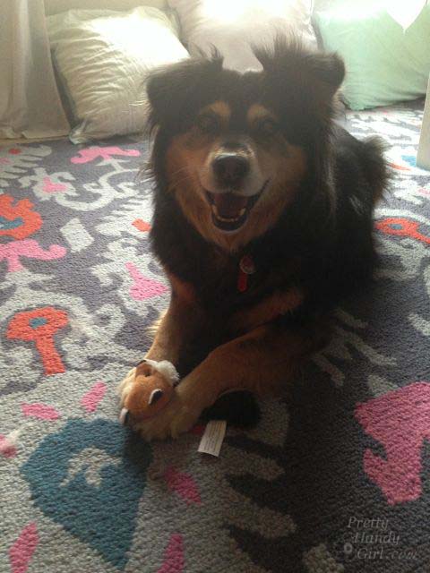
This is the photo right out of my phone after I snapped the picture:
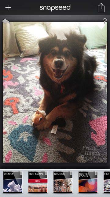
I used SnapSeed to adjust brightness, contrast, saturation and a few more settings. I find using SnapSeed really helps my phone images look a lot better.
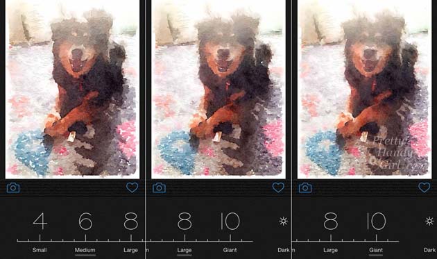
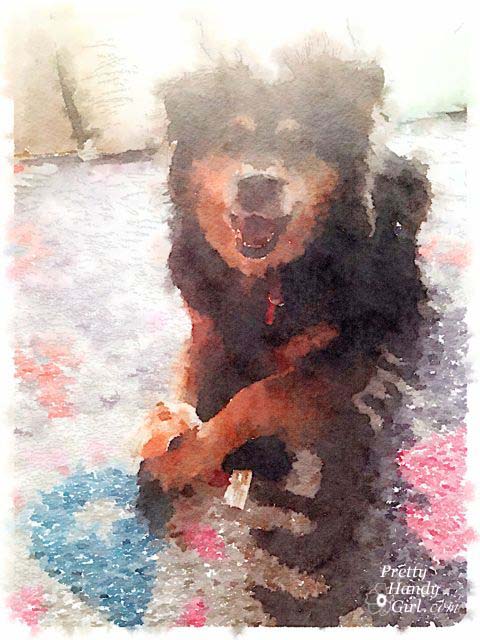
Once I bring that edited image into Waterlogue, I play with several of the settings in the Waterlogue app. I’ve found that if you are using an image of animals or people, it really helps to increase the amount of detail shown by choosing Large or Giant (only available for newer iPhones) image size. The larger the size, the more detail Waterlogue retains. You can see in the example below, that Buddy’s eyes are lost in the medium setting. It isn’t until the Giant setting that you see the highlight in his eye, which makes his face more recognizable.
I used the giant setting for my final image because it helped retain the definition in Buddy’s face.
However, there are times that I like a looser painting. For example, landscapes look great when broken down to blocks of color with less definition.
Now, onto my Top 20 #PrettyWaterlogueApril images for Week #2!
ln no particular order, here are my favorites this week. Be sure to click on the link below the picture and follow these talented artists on Instagram!
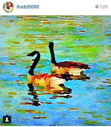
by ltodd5000
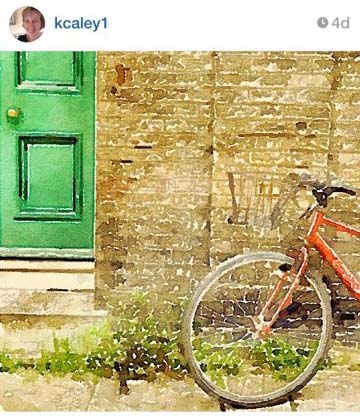
by kcaley1
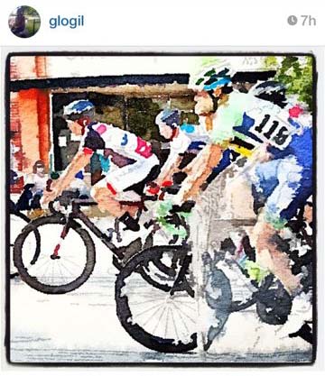
by glogil
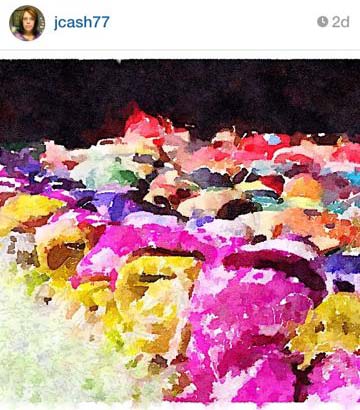
by jcash77
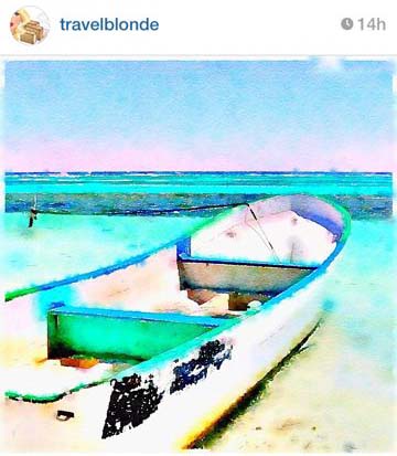
by travelblonde
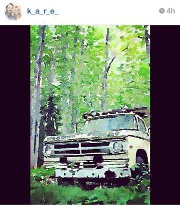
by k_a_r_e_
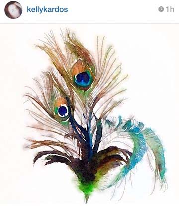
by kellykardos
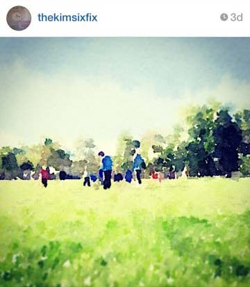
by thekimsixfix
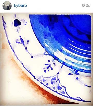
by kybarb
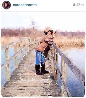
by caraschramm
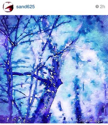
by sand625
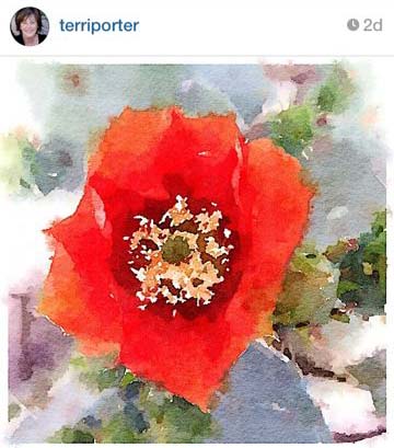
by terriporter
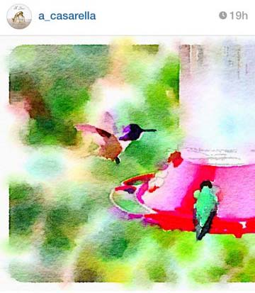
by a_casarella
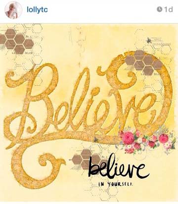
This last image is one that is a beautiful collage of images by Leah. She consistently puts up amazing art that are beautiful collages using the Rhonna Design app and Waterlogue.
by lollytc
I can’t wait to see what y’all come up with this week! Follow along by viewing #PrettyWaterlogueApril on Instagram! By the way, it’s not too late to join in! I’d love to see your Waterlogue masterpieces. Simply use the hashtag: #PrettyWaterlogueApril in your description field.


Aloha all–I just purchased waterlogue ap today and love it. But I have a question and I hope someone can help.
When I started playing around with it, the 1st choice of finish was one called “natural”, followed by Vibrant, Bold, Luminous, “It’s Technical”, etc.
I sent myself a couple of different versions of some photos and now the “Natural” setting (which I like very much) is no longer one of the choices. It’s gone. Poof! There is nothing that I consciously did to delete it and I can’t explain what happened to that filter option. I turned the ap off and on again, turn the whole phone off and on again. I’m stumped.
Anyone out there have any ideas how to get that choice back?
Kathleen, I’m sorry I don’t know. I looked at my Waterlogue app and don’t see Natural either. ;-(
Problem solved and want to share in hopes to help others.
I gave my phone to my teenage daughter who (rather quickly) figured it out. If you look at vibrant (the 1st icon now) you can see that there is something peaking out from behind that icon. Tap on the vibrant icon and “natural” comes to the front. Tap it again and vibrant is in front again.
Also, same is true for “it’s technical” There is another image mode hiding under it. I hadn’t noticed that before.
Any suggestion anyone has to improve the quality of faces I would appreicate hearing those, too. I did try setting the size to giant–but still leaving a little to be desired.
Aloha all–enjoy your photos and have fun sharing.
Kathleen
Great job on the wl images. I just downloaded it to my pc (windows 10 not a mac or iphone)
I found the same thing with faces in their FAC section. Use the largest and CROP as much as possible to define as a “face”
I wish there was (or at least I haven’t found yet) a filter for “intensity of effect” as I think their algorithm is too strong. I would like to apply the waterlogue effect to my photos (I used to go to Paris a lot) http://members.virtualtourist.com/m/48d21/18308/
and would like waterlogue to be more subtle in it’s effect.
Any advice you have would be much appreciated. Would you please email me if you have any suggestions or advice? Thanks again for the pics.
davequ
email (disguised to prevent bot spam) dave underscore queen at hotmail dot com
Thank YOU so very much for choosing one of my “waterlogued images”…and for the very kind words!! It really made my day! This has been an awesome, wonderful photo challenge. I really look forward to all the lovely “pieces of art” each day! Kudos to you, my friend:) xo
I love how some of those images are really obvious what they are, and others are completely abstract. It is so fun to putz around with all the different settings to see what the images look like rendered with the different algorithms. I’ve been having a blast waterloguing this whole month! What a great idea this was!
So many great ones here, difficult to choose. Great job ladies!
Wow! There are so many good ones! I sure love using this app! Thanks for the tips. Hugs, Diane (I’ll send you a couple more! lol)
Thanks! And please do send me more. I love your emails with beautiful art attached.
I want to be on that boat so badly! So fun seeing one of my pictures up there – thanks. I don’t envy you having to narrow down your choices. I love them all!
Thanks so much for choosing one of my images this week! I am completely enjoying this month of Waterlogue beauty. Thank you!
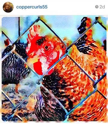
You picked some beautiful one. I especially like the chicken, hummingbird, and the photographer.