How to Pick Color Palettes: Color Harmony in Decorating
Color Harmony in Decorating
One of the most frequent complaints from homeowners is struggling to choose colors for their home. When you walk into the paint store, the color selection can seem overwhelming. Choosing a rug or furniture can be equally daunting. Today I’ll give you some tips and tricks for creating color harmony in home decorating. You’ll learn a little knowledge about color theory, complements and harmonies that make choosing colors much easier. Plus, you can use the same theories in almost any visual field. From graphic design and web design to choosing your outfit for a big event. Pretty soon, you’ll be able to put together pleasing color palettes with ease.
I’m sure you’ve stumbled across art, paintings or photos that use visually stunning color palettes. Chances are that the artist or designer put thought into each color and how they work together. Let me introduce you to color relationships and harmonies!
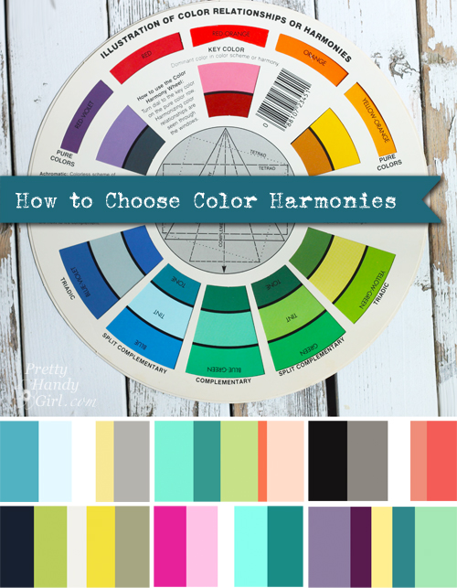
You’ve heard the term complementary colors, but do you know what defines a complement? Here are the definitions of the various color relationships or harmonies and some great sample palettes you can use in your home!
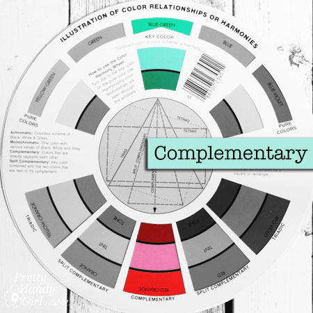
Complementary Colors:
One of my favorite color combinations are the gorgeous pinks in a bouquet of peonies paired with an aquamarine ball jar. Something about this palette stops me in my tracks every time! The reason this pair grabs my attention is that those two colors are complementary.
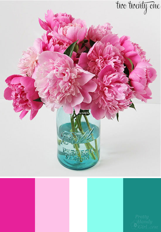
Photo courtesy of Two Twenty One
Red/orange and blue/green are directly across from each other on the color wheel which makes them complementary or a perfect pair. (Kind of like wine and chocolate…right?!)
Here is another example of a complementary color palette. Blue and orange are stunning together. All the blues are balanced by a few pieces of fiery orange that demand attention in Sarah Richardson’s nursery below.
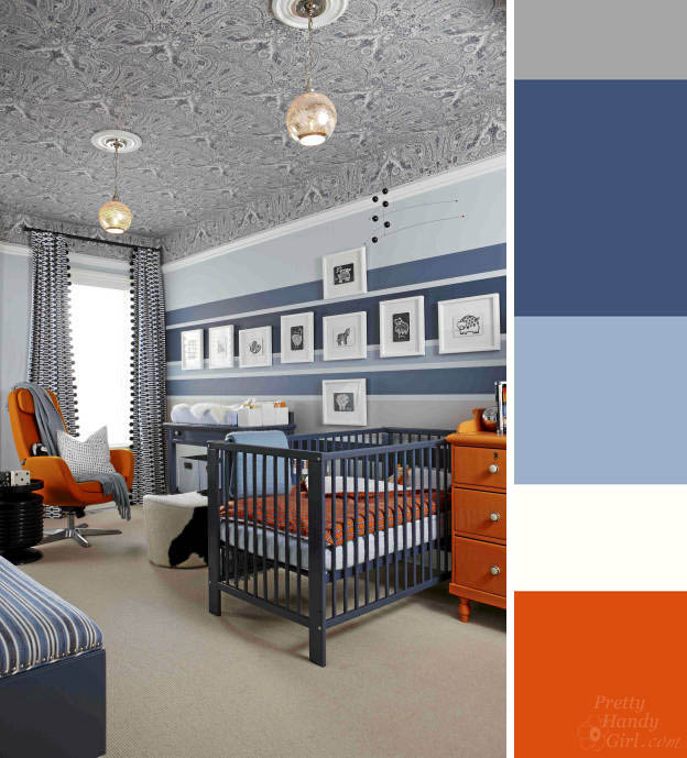
Photo courtesy of Sarah Richardson via HGTV.ca

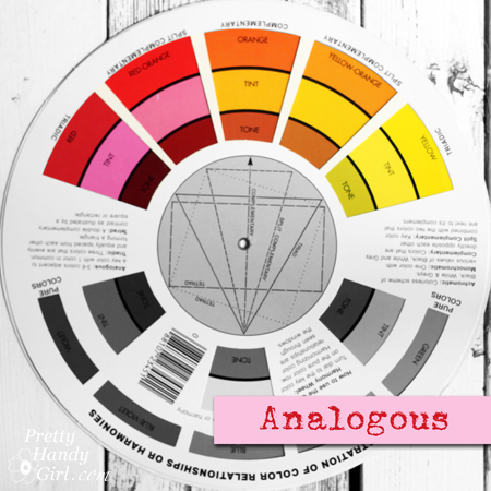
Split Complementary Colors:
Elise from Grow Creative is my newest favorite eye candy blog. She is a watercolor artist and photographer. You should definitely subscribe to her blog for a visual pick me up every time she posts! Her watercolor painting of a cactus contains a great example of the split complementary relationship.
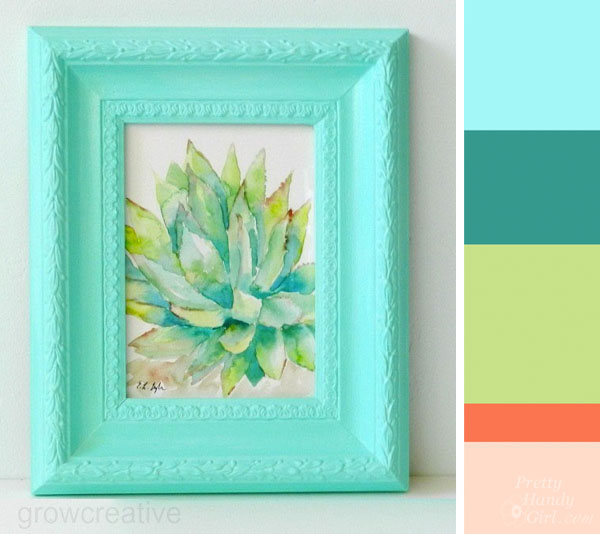
Photo courtesy of Grow Creative
Although, she only used a little of the bright red-orange color at the tips of the cactus, the bright color holds its own opposite the blue and green split. Without the orange, this painting would still be beautiful with an analogous palette (see the explanation of an analogous palette here.)
In the photo below of the Thistle from Grow Creative, the opposing colors have a wonderful split complementary relationship.
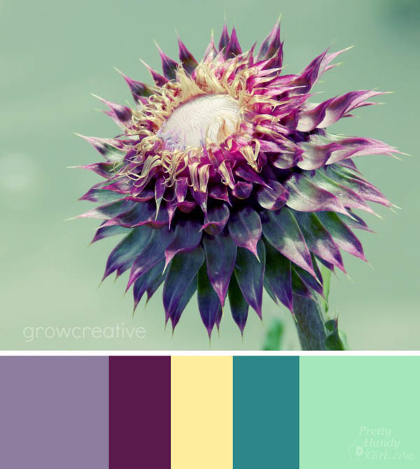
Photo courtesy of Grow Creative
The purples and green steal the show for sure, but the small hint of yellow gives this photo more complexity.
Analogous Colors:
While attending the La-Z-Boy event, I fell in love with Beth from Home Stories A to Z’s room design. The dark and light contrast of the navy with the crisp white doors stole my heart for sure. But, the decor colors really complete this stunning palette.
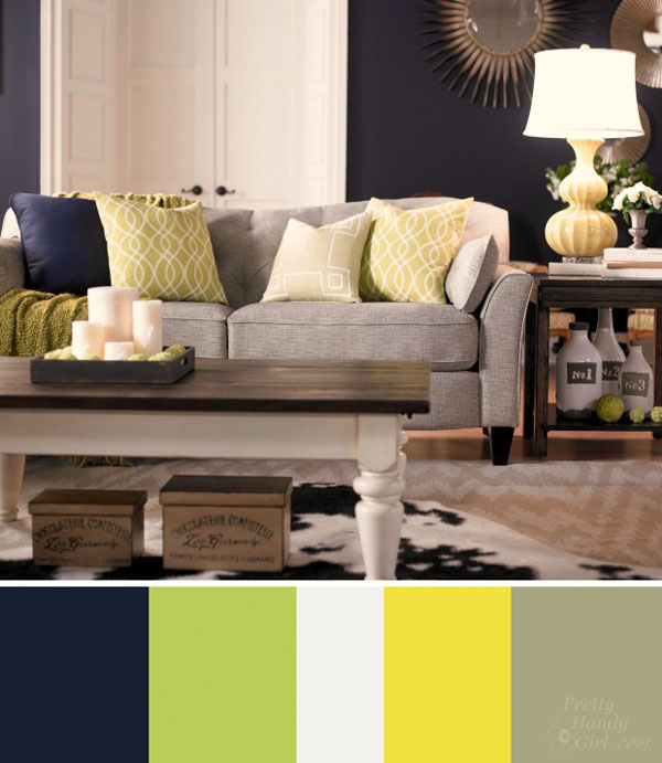
Photo courtesy of Home Stories A to Z
The key colors in her room are navy, light green and yellow. The white and grays are neutral therefore, they work with any color. Together you have a great example of an analogous palette.
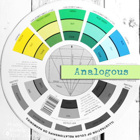
Another example of an analogous palette is seen in this photo of a paper floral table runner by Fiskars:
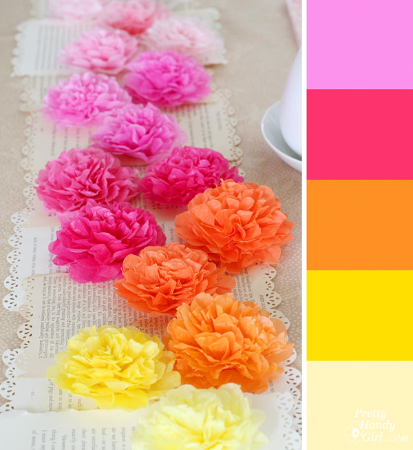
Choose colors that are adjacent to each other on the color wheel for a gorgeous analogous palette. These colors together are sunny, warm, energetic, but most of all harmonious.
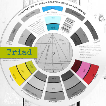
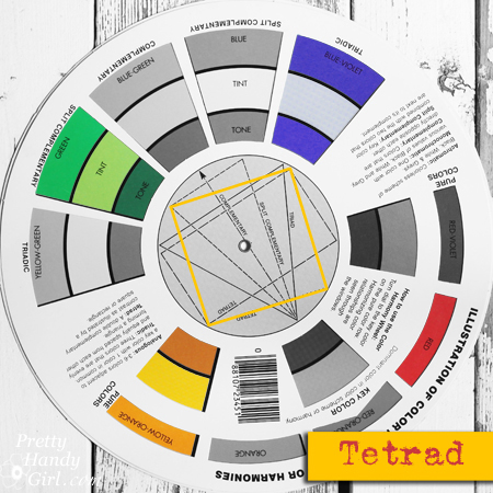
Tetrad and Triad Palettes:
Now we’re getting into a few of the more complex palettes. They aren’t hard to use, but do require a little more thought in terms of amounts and value. The bold palette in this dining room works well because they are presented against a neutral black and white backdrop.
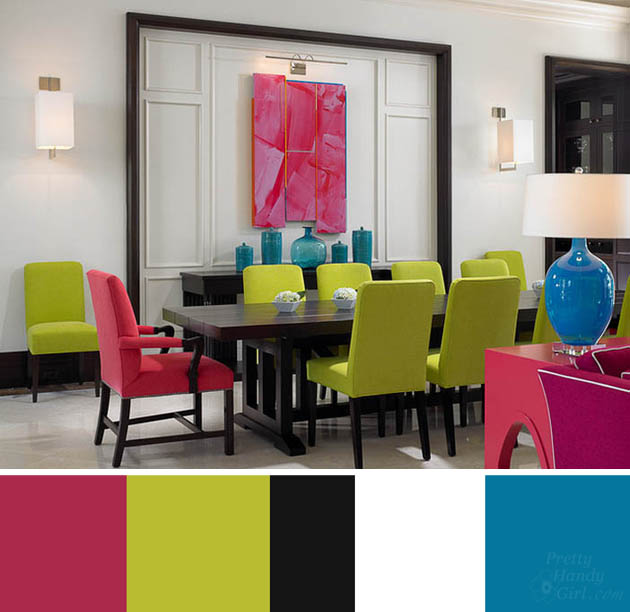
Photo courtesy of John David Edison Interior Design in Toronto, ON
The blue, yellow and pink colors form a perfect triangle on the color wheel making them a great example of a triad relationship.
This bouquet my husband gave me for my birthday is a wonderful example of a Tetrad palette at work.

The four colors (red/yellow/blue-violet/green) are equally spaced on the color wheel. Using all these colors in a room design can be gorgeous, but you should choose one main color and a secondary color that will dominate and let the other two colors take up less visual space. As an alternative, you could balance the bold colors with a large amount of a neutral color(s) as shown in the dining room above.
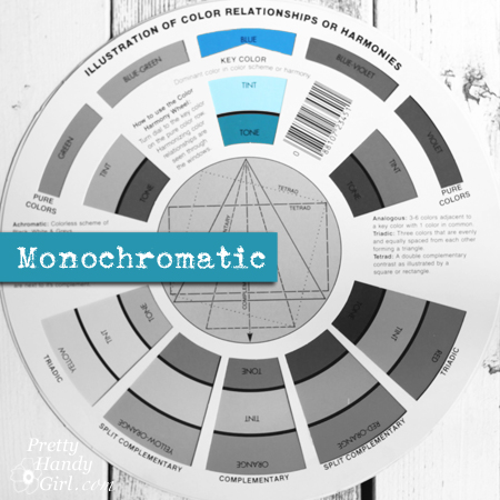
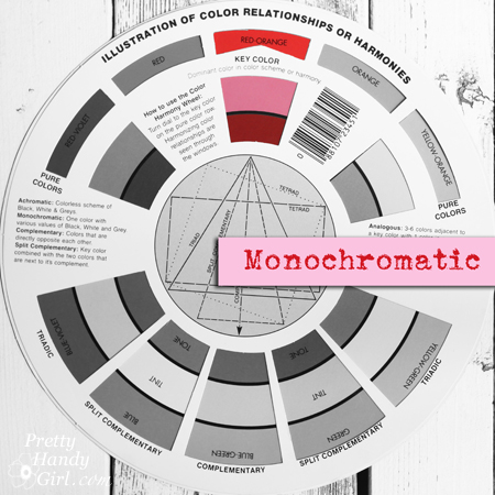
Monochromatic:
After explaining some complex color relationships, I wanted to leave you with a very simple palette. The monochromatic palette is comprised of one color used throughout a room with differing values (shades of that one color achieved by adding white or black.)
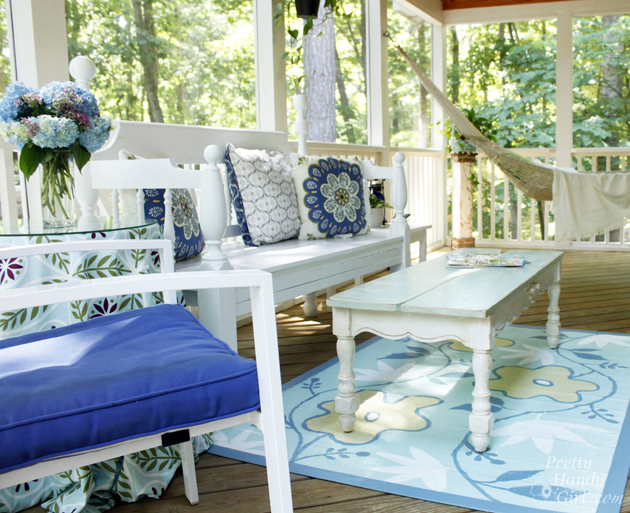
My screen porch has a monochromatic palette. Using a variety of shades of blue with white creates a calming palette that’s easy on the eyes (and invites one to sit for a while and relax.)
For a little more punch, you can pair one color with black and white.
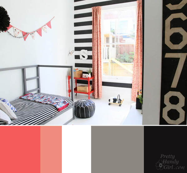
Photo Courtesy of MintSix Boutique Homewares and Styling in New Zealand
Mint Six Boutique creates a beautiful example of a monochromatic palette with several shades of red and coral in this bedroom.
The coral color steals the show, but is highlighted by the contrasting black and white in the room. Using strong contrasts in your home are sure to create visual impact.
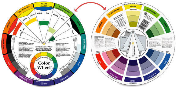
Where to Get a Color Wheel:
Creating new color palettes is easy if you use a color wheel. You can purchase a color wheel on Amazon for less than $10! Once you have one, you can use it to choose colors for a room palette, coordinate your outfit for a big event, tablescapes, logo design and much more.
Before you have one of these great color tools on hand, you can visit ColourLovers. It is a website that allows you to browse color palettes:
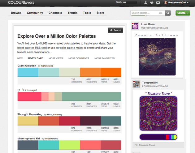
(Feel free to follow me on COLOURlovers, as I upload my new favorite color palettes.)
Or you can create your own palettes. One of the best tools on their site is Copaso (found under tools). You can use it to upload pictures and/or create color palettes from scratch. To see suggested complements and harmonies, select one of the buttons below the color wheel.
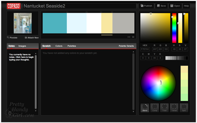
Find photos that have color palettes you love (Houzz and Pinterest are two great places to start). Then upload the photo in the Copaso program. The program lets you pixelate the photo so you can select exact colors (you can also fine tune the hue and value until you reach your desired color.)
![]()
I uploaded this beautiful seaside home from Houzz to create a new palette of seaside colors that appeal to me:
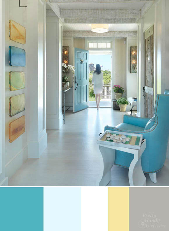
Photo Courtesy of Donna Elle Seaside Living in Nantucket, MA
Next time you are thinking about shopping for home decor, paint colors or furniture, have a plan before you go. Use color harmonies and complements to help you solidify your color palette. Planning ahead will help avoid that overwhelmed feeling.
Pin this post to refer to next time you are trying to figure out good color harmonies!
Enjoy picking fabulous color palettes from now on!

Unfortunatly this anlysis is often inaccurate and misses the fact that color harmony is more than hue, which is just one dimension of color.
John David Edison Interior Design in Toronto is not harmonious at all. To me it looks ugly and very uncomfortable. The main porblem is that there are too many different hues with very high chroma, without low chroma shades connecting them. As a result, they look out of place and the image looks flat and unnatural. To make it even worse, the remaining colors are all near the extremes of black and white and there’s some turquoise, which doesn’t fit into the triad-scheme, which creates enough tension anyway.
The spacing of the colors in the color wheel and the representation of colors on it are both inaccurate. For example, in the image of the flowers, the four colors are far from being equally spaced. Purple is actually nearly complementary to the green and the remaining colors both lie on the warm side between those two. So the color chord lacks symmetry and not so straight forward to interpret. Yet in my opinion it works pretty well, even though the pink doesn’t really find a good spot in there.
Analogous color intervals don’t work well by just combining all the hues within a random window of colors. First, since hue doesn’t create a lot of contrast, a change in value across the range is critical to accomplish this. The image of the yellow, orange and pink flowers already misses this. Second, it’s known that nearby hues clash with each other. Therefore, analogous color harmony should be thought as only two colors at the ends of the spectrum blending with each other to create more muted hues in between. So the orange and red should seemingly blend into the color interval and not jump out as they do in the example image. Third, the size of the color interval is not random, but is critical as well. Colors too close to each other miss to create a good contrast and clash with each other.
I know this is an old post, but i just found it and I LOVE it! This is the best explanation i have found for using a colorwheelbin decor, but the principals will obviously work with art, also! Love the website you shared too! Pixelating and analyzing the colors in photos could also tramslate well to making art, and welecting harmonizing colors! SO, THANK YOU!! I love to decorate, but i also want to try my hand at painting some art for my spaces, and this post will help with both, you are AWESOME! I love this whole series, actually! But your post is very well researched!
Thank you Julie! Glad you found the post.
Thanks this post!!! I’m such a advocate for color and love it when people appreciate and understand how to use colors together. Thanks again.
I was very impressed with the Series: How to decorate featuring 25 bloggers
I’ve been decorating the room for 5 year old boy and 15-year-old girl of mine. My children enjoyed.
Your post turned out great! Thanks for including some stuff from my blog…. makes me feel pretty cool!
Elise, thank you. And for the record, You are pretty cool!
I remember seeing the color wheel for the first time in high school home-ec class. It was fascinating, and I never grow tired of learning about the science of colors. Thanks for the refresher course!
Leslie Anne, I had to do some refresher myself. It’s been ages since I learned color theory in art school.
Great post, I am loving this series. So much fabulous information.
Thank you Marty! I hope it is helpful.