I’ve had some time this week to catch up with some of my girlfriends. Sometimes this means it was a few minutes in the parking lot at preschool. Or a phone conversation. I definitely value their friendships and wish I had more time to spend with them (thankfully most of my girlfriends are mothers as well and recognize time is not something we have a lot of right now).
One of my good friends (who was also born a Cancer), and I were talking yesterday. It is really scary how similar our personalities are. She was naming off several traits that fit both of us to a tee. One of them was the ability to throw ourselves into something, not halfway but whole-heartedly!
I always thought this was a good trait (but certainly recognized how it can be all consuming sometimes). Then she stopped and said, “But there is one difference between you and I. When you see something new you want to learn, you throw yourself into it and revel in the challenge. Whereas, I am sometimes uncertain and afraid of failing.” I realize that we all have this fear of failure to a certain degree. Obviously some more than others.
I have been skydiving once in my life. Was I scared? Yes!
But that emotion flew out the window, and then I loved it.
I will do it again someday, but not until my children are grown.
One of my challenges has been decorating. I wanted to share this with you because, decorating is not something that came naturally to me. In fact, I am somewhat tentative to even share some of these pictures with you. What I have learned has come from many designers and decorators (check out the list of “a few other sites you might like” on my sidebar) who have graciously shared their secrets and design tips with their readers through their blogs. One in particular has a motto that frees you from the “everything has to be perfect” mentality. The Nesting Place written by the Nester really forced me to forget perfection and “Just Do It!” (Sorry, Nike.) Her tagline says it all: “It doesn’t have to be perfect to be beautiful.” I encourage you to hop (no, make that LEAP) over to her blog and download this FREE eBook on “It Doesn’t Have to Be Perfect to be Beautiful.”
I read the eBook from cover screen to cover screen. And I have thrown away those “perfect” shackles and made my house MY home. And I did it without spending a lot of money.
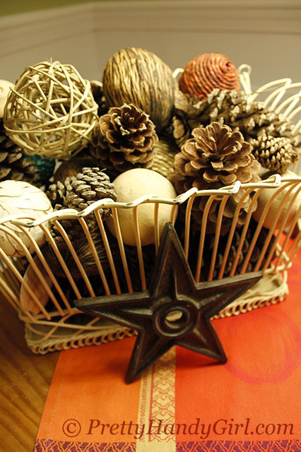
I have finally embraced Autumn and am willing to share with you my fall vignettes and decorations. I want you to know that I purchased very little this month (thanks to a very special woman over at the T-shirt Diaries. She challenged fellow bloggers to forgo spending anything on crafts, etc. this September.) If I purchased it this year, I’ll share with you where and how much I spent. If it isn’t listed, I already had it in my stash. But, it is likely that I found it, transformed it from junk, or got some amazing deal on it.
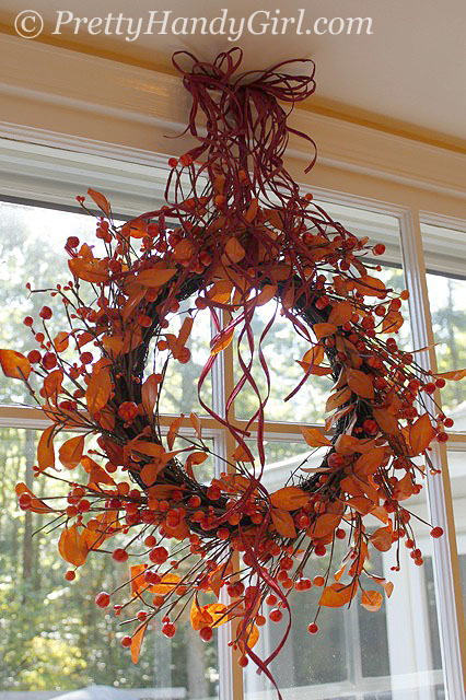
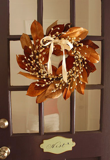
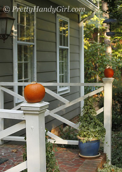
Without further ado, here is my imperfect and inexpensive decorating for fall:
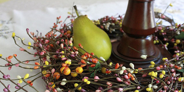
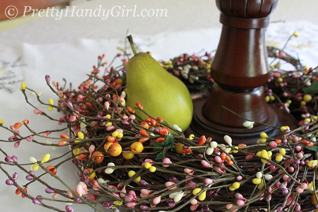
Wreath $12 from Home Goods purchased over summer.
Bowl & fruit $15 from Craig’s List.
Vase $2 from Goodwill, beauty berries & nandina berries from our yard.
Two pie pumpkins used as post finials. $2.50 each from Kroger.
Grocery store pumpkins made into topiary and fringed rope (already had).
My boys love to get into the decorating act.
They love to put their touch on our kitchen window each new holiday.
I encourage you all to throw away that “perfect” mentality and try something new this month! It is okay if it doesn’t come out perfect. Love it if it is a reflection of who you are. If you hate it throw it away and use it as a learning experience, but don’t give up. Try it again!
Let’s not forget how we all learned to ride a bike or even walk. Were we afraid to try it? Probably. But, we tried it anyway. Did we give up when we fell the first time? No!
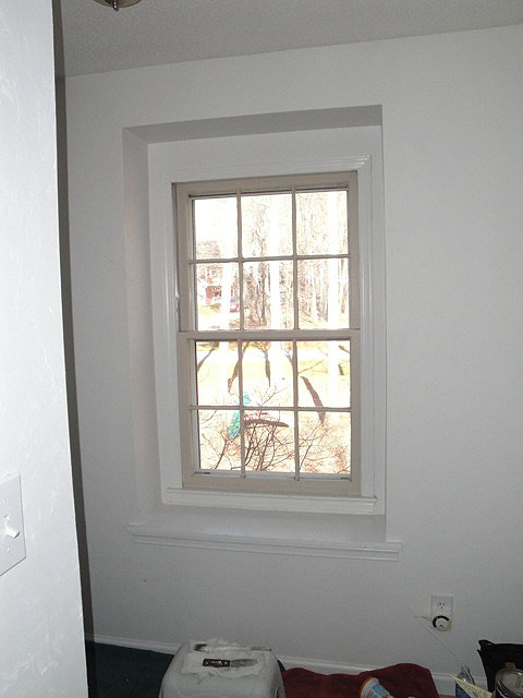
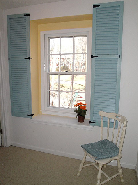
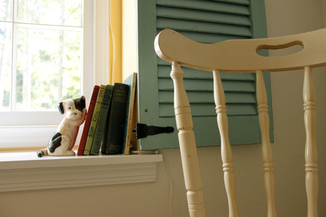
I love the little recessed ledges inside each dormer. But, the window in our hallway always looked so sad.
Then one day it hit me! This poor window has been neglected and has no character, jewelry or bling! For whatever reason (maybe because I was sleep deprived?) it took me a year to realize that the window itself had not been painted white like the other windows in our home.
The first thing I did was grab a paint brush and paint the muntin bars (or grille), the bars that separate and hold the panes of glass. Don’t say I never taught you anything on this blog! Want to learn more about the anatomy of a window? Look on Pella’s website.
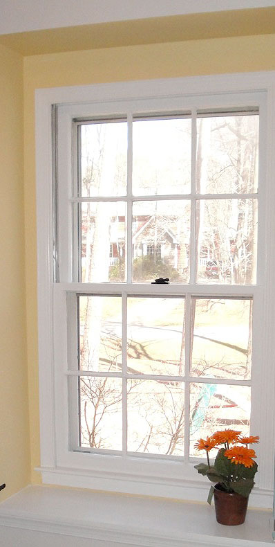
It looked better, but there was too much white, so I painted the recessed area a sunny yellow.
Wow, that looks better! But, the window still looked a little stark. That lonely plant just wasn’t pulling its own decorative weight.
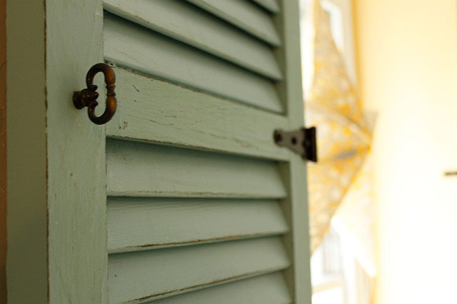
So, I ran up to the attic where all the original shutters from our home are stored. I pulled two out of the attic and painted them with a pretty aqua blue oops paint.
Next, I took a sand paper and roughed up the edges and distressed them until you could see the dark green peeking through.
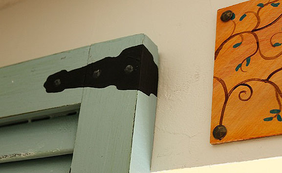
I bought four gate hinges at Lowe’s and mounted them on the bottom and middle rails. I knew that there were studs on the edges of the window well, so I drove my screws into those corner studs.
The tops of the shutters protruded over the window well, so I couldn’t use a gate hinge there. I painted a faux hinge on the shutters instead.
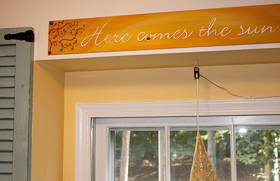
I also painted a little sign over the dormer to fill up the visual blank space between the tops of the shutters. The board was just piece of scrap cabinet toe kick. And, yes, those are simple upholstery tacks holding it to the wall.
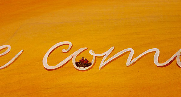
To create this little sign, I found a font I liked, then typed out the phrase on the computer. I was able to tile two sheets together to span the width of the board. I rubbed pencil on the backside of my paper. Then traced the letters on the front of the paper. By pushing hard with the pencil, my type was transferred on the wood. This allowed me to paint over the pencil marked letters: “Here Comes the Sun…” one of my favorite Beatles songs.
Sweet little birds waking up in their nest.
I dressed up the shutters by adding little keyhole drawer pulls.
I accessorized and put a little $5 Goodwill chair in the corner.
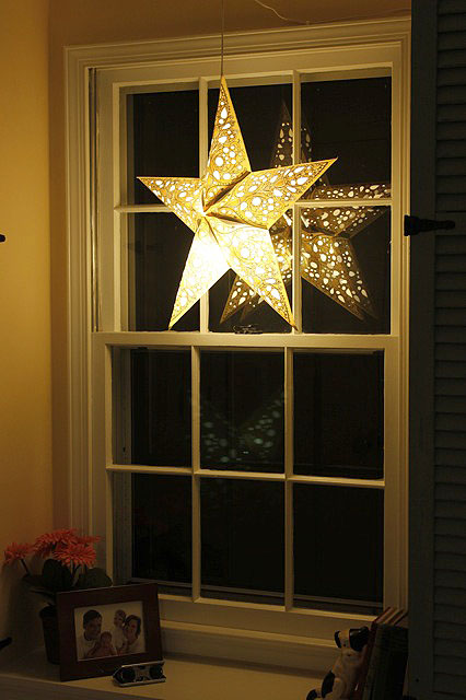
Around Christmas time I hung the star light for decoration, but it puts off the perfect amount of light for those darn night wakers. (Anyone else have those in your home?) So, it now hangs year round.
I think this window is very happy now!
What do you think? Does it need anything else? Maybe paint the chair or distress it? Or maybe that chair just needs a colorful cushion.
https://prettyhandygirl.com/wp-content/uploads/2010/09/keypull.jpg426640Brittany Baileyhttps://prettyhandygirl.com/wp-content/uploads/2021/07/PHG-logo-tagline-2020-1030x211-R.jpgBrittany Bailey2010-09-18 17:07:002021-08-23 19:19:07Dressing Up a Dormer Window with Shutters
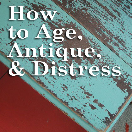
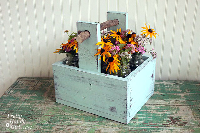
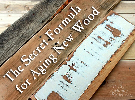
Well, despite the fact that I am starting to feel my age, this post will help you achieve that beautiful well worn, loved, aged and antique look on furniture and decor items. This is something you can do to new furniture or to give old furniture a new rustic look.
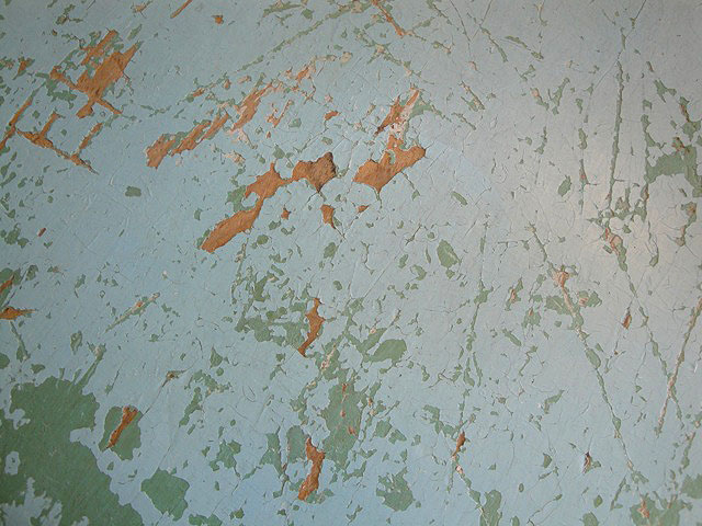
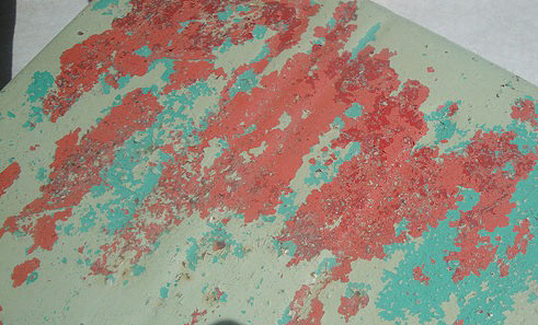
Aren’t these layers of paint, scratches and wear marks art to your eyes?
Nothing shows character like chipping paint and multiple revealed layers on metal.
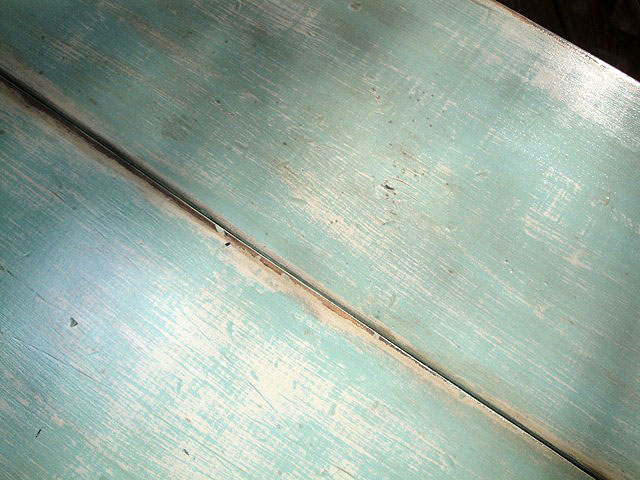
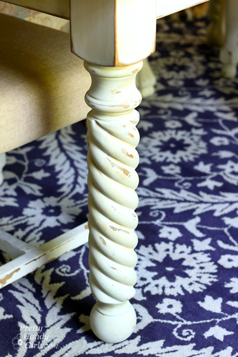
Weathered paint worn thin and rubbed off give a table character!
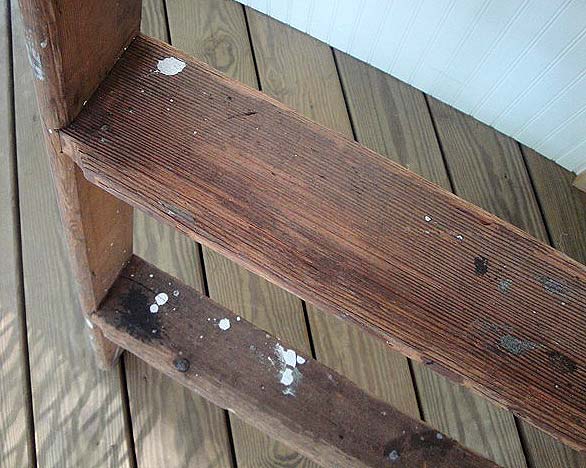
Paint splotches on an old ladder beg to tell stories of the projects it has seen.
And you can’t forget rust, love that beautiful brown patina!
I have been experimenting with several techniques to add age to “newer” pieces of furniture. Here are a few ways to add some character through distressing. (This post contains affiliate links. To learn more read my disclosure page.)
Distress Marks:
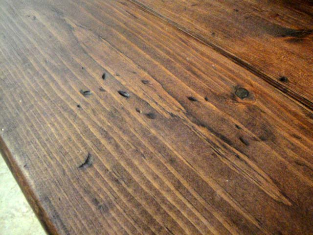
Achieving a worn look can be as easy as adding dings and scratches. This process can also be a great stress reliever! Grab some chains and let’s work out some of that pent up aggression!
Throwing a chain at wood gives you those elliptical dents. Dragging the sharp edges of a pry bar across wood will give it some deep grooves. Set a screw on its side and lightly hammer it into the wood. Finally a few random hammer marks here and there finish off the worn look.
This is the same technique I used on my mudroom bench.
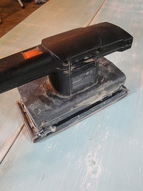
Sanding through layers:
The easiest way to add some age to a piece of furniture is to expose layers of paint. Whether you paint a few contracting colors on yourself or you sand a pre-finished piece, sanding is one of my favorite ways to add age. A note of caution: Before you begin sanding, always check for the presence of lead paint. You can learn more about how to detect lead paint in this post.
You’ll get the best results using 150 grit sand paper (but use whatever you have on hand). Attach it to your power sander and go to town on the furniture! Work in areas that would normally get a lot of use or abuse. Corners and edges of furniture usually take more abuse. Table center is a good place to show signs of worn paint. Be sure to move the sander around and be random rather than symmetrical. A good example of a sanded finish can be seen on this Trashy Coffee Table.
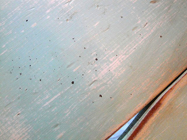
A table that was previously painted white received a sea-inspired blue layer of paint on top of the white. (You could always add a third color if you want more colors showing through.) Sand through the layers of paint down to the bare wood in spots. The challenge with a new piece of wood is it lacks the deeper darker color tone of antique lumber. Unfortunately, when new wood is exposed, it will look blonde and – well – brand spankin’ new. Read on to learn how I solve this problem.
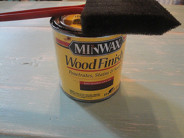
Faking Age with Stain:
I have a trick up my sleeve for creating those darker wood tones in seconds! Ready to learn my secret?
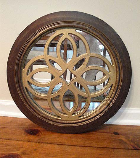
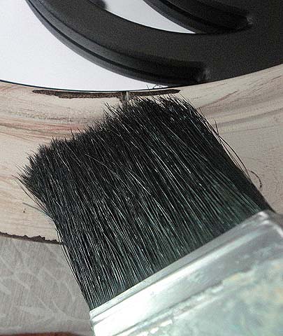
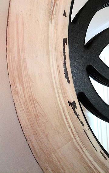
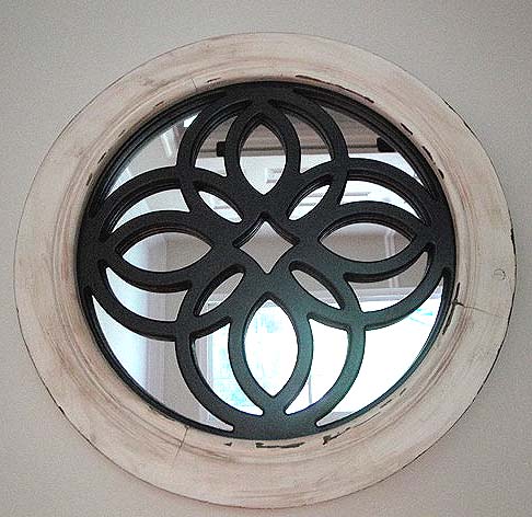
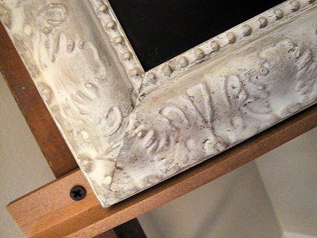
You can use the same dark stain to give your object a faux “tea stain”. This antique gold 80’s mirror is easily transformed with spray paint and some stain.
If you use regular white spray paint, it will be difficult to “dirty” your object. Instead I like to use Rust Oleum Heirloom White which gives a soft antique white look. (FYI, I used Rust-Oleum Oil Rubbed Bronze for the inside decorative design.)
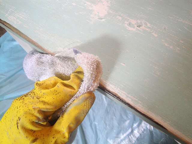
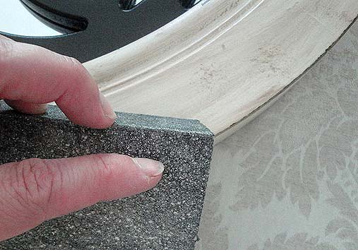
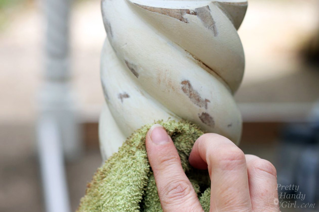
After the paint dries, hand sand some of the edges to expose the stained wood beneath.
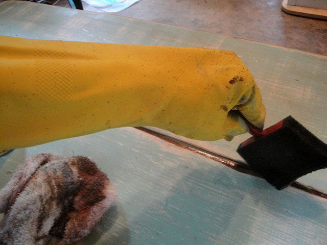
Use a dry brush technique* to brush on the stain and wipe the excess off immediately. *Keep your brush dry by dipping in the stain and wipe off your brush on a rag before using it.
For the best results, use an old shaggy brush or rough up your chip brush. The rattier the brush the better because anywhere the stain lands is where it will remain.
The end results are pretty tea stains and peek-a-boo dark wood below.
Glazes add depth and dimension to furniture that has a detailed profile. Glazes can be used on everything from kitchen cabinet doors to table legs and picture frames. But, don’t let that limit the places you can use glazes.
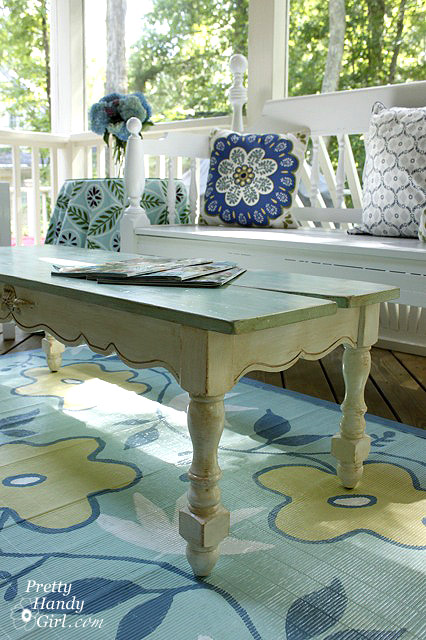
The table legs on my DIY Farmhouse Table have Van Dyke glaze on it that accentuates the rope turns.
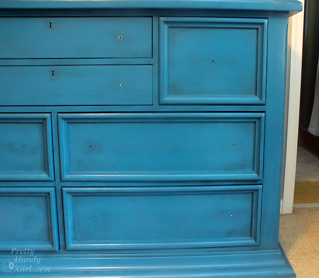
This dresser needed more than a coat of paint to give it an attractive new look. I added black glaze for pretty gray tones.
Simply brush on the glaze (again use a ratty almost dry brush.) Push more glaze into the gouges and crevices to show off the details.
Wipe off any excess with a clean dry rag.
The glaze stays wet for longer than the wood stains. It can be wiped off immediately if you make a mistake. Once you like the look, let the glaze dry to permanence.
It may take a while to build up the glazing. But, you end up with a really nice final product.
Spattering:
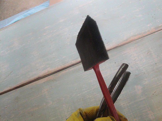
Another technique I like is adding paint or stain spatters. This is easy to do, but if you aren’t wearing protective clothing you might give yourself some freckles.
Dip a foam brush into the stain and wipe off any excess. Then gently tap the brush on a stick or handle of something sturdy. (A large screwdriver or other solid object works well.) This time I don’t wipe the stain off. Let it dry a little then dab up any excess.
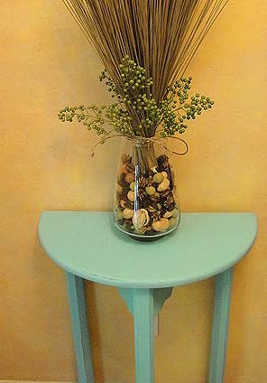
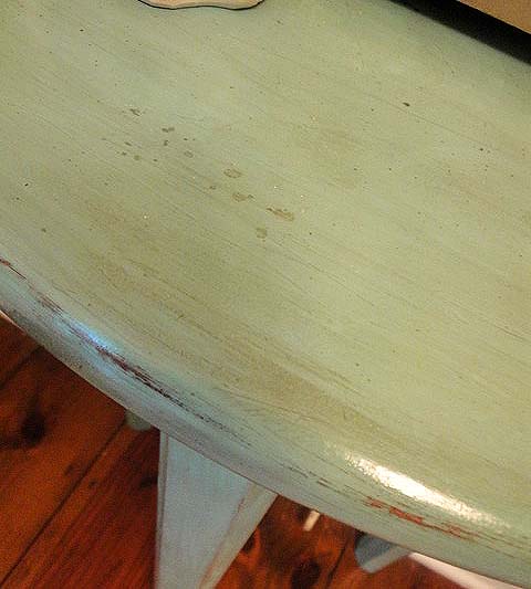
With these techniques, you can take a plain painted side table from this:
To a more sophisticated antiqued older sister:
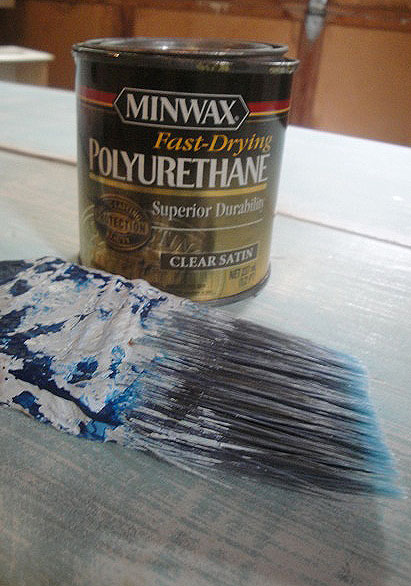
Protective Coating:
Once you have achieved the antiqued look you like, be sure to put a protective coating over your furniture. I prefer using Minwax Oil-Based Polyurethane. This adds the perfect age to furniture. (If you use new oil-based poly, it will yellow in a few years time.) If you don’t like the yellowing effect, stick to Minwax Satin Polycrylic.
Now, don’t be distressed, grab some sandpaper and a brush and give your furniture an age boost!
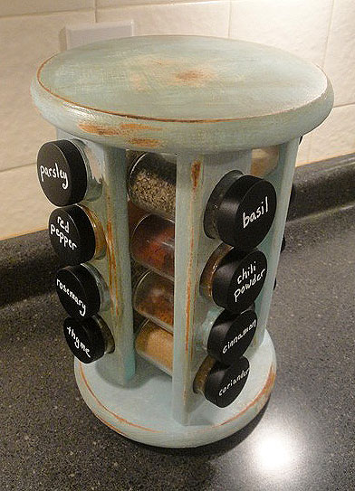
Yard Sale spice rack turned rustic! Chalkboard lids tutorial here.
Watch a live tutorial to see how I accomplished an aged paint look on this trough. And be sure to subscribe to my YouTube channel to get notifications when a new video is uploaded.
Now that you have some aging and distressing techniques under your belt, you can push your skills by trying your hand at some more complicated techniques! Like creating a faux wood texture on surfaces following this tutorial.
https://prettyhandygirl.com/wp-content/uploads/2010/09/age_antique_distress_wood.jpg420420Brittany Baileyhttps://prettyhandygirl.com/wp-content/uploads/2021/07/PHG-logo-tagline-2020-1030x211-R.jpgBrittany Bailey2010-09-07 07:44:002018-07-10 15:54:21Aging is so Distressing – Techniques for Antiquing Furniture
…to another busy day in the life of Pretty Handy Girl!
I had fully intended on posting a tutorial on distressing furniture for you today. But, I got side tracked today and then let’s just say that my evening ended up with a visit from these guys:
Thank you Raleigh Fire Department for putting out my oven fire!
Let me tell you, it is a scary thing to see your heating element turn into a 4th of July super-sized sparkler! Luckily no one was hurt and our kitchen is still white (not smoky gray.) Needless to say, we will be in the market for a new oven this week. Any recommendations or “steer clears” would be appreciated. And a word of advice, if your heating element shorts out, sparks and catches fire, turn off your circuit breaker.
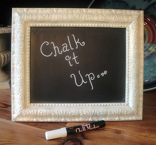
Not exactly what I planned on dealing with today! I did have plans for one tiny little project. This little project had me on a hunt for the illusive and extremely rare chalk marker. I have been looking everywhere for one of these exotic creatures.
Target – nope
Walmart – nope
Ace Hardware – nope
JoAnn’s Fabrics – nope
Jerry’s Art-a-rama – Ding, ding, ding! Finally found it!
If you’ve been around the blogosphere lately, you have seen chalkboard paint projects everywhere! I probably wouldn’t be surprised to see a chalkboard painted dog next week.
I had some leftover chalkboard wall decal material, so I cut a little label for our jar of colored pencils. But, I really wanted a chalkboard marker so I could write on the label and not worry about it smudging from little hands using it daily.
So, naturally after using my new chalkboard marker and LOVING IT! I decided to paint some more things with chalkboard paint and use my new marker.
I put up my homemade spray tent (I’ll have to show you how I made it later.)
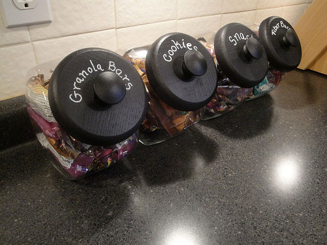
And got busy. My mind played “Back in Black” in my head as I sprayed. (Any other AC/DC listeners out there?) I decided to use automotive black primer (for better adhesion on the plastic spice lids.)
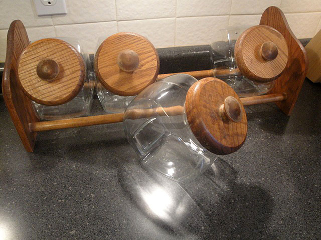
First up where these Goodwill candy jars all four and the rack for $6.99!
U-G-L-Y oak lids, but not for long…
Blackified, labelled and now looking good.
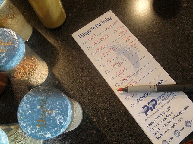
Next victim was a spice rack and jars (I’m embarrassed to say)
that I repainted years ago.
That’s right, back in the sponge-era.
The gold ink labels are impossible to read.
I carefully lined them up and made a list of the order
they were in to make re-labelling them easy.
Seemed like a great idea, UNTIL my oven caught fire.
Then I swept everything off the counters and away from the stove.
After testing my sense of smell, I put the lids back on. And now that I can read them,
I shouldn’t mix up red pepper and paprika anymore.
The rack received several layers of treatment to give it a distressed look.
https://prettyhandygirl.com/wp-content/uploads/2010/09/newspicelids.jpg480640Brittany Baileyhttps://prettyhandygirl.com/wp-content/uploads/2021/07/PHG-logo-tagline-2020-1030x211-R.jpgBrittany Bailey2010-09-01 22:57:002021-08-23 19:23:45Chalk it up…to a busy day.
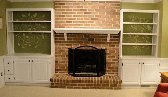
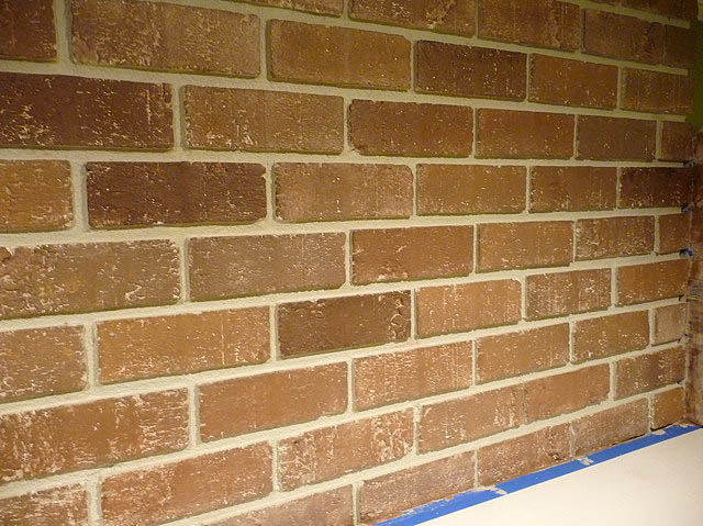
On Monday I showed you my fireplace painting from white paint back to brick. This was only one step in our major living room renovation. I hope you will hop back again this week to see some of the other transformations we made to this room:
And as promised, we’ve arrived to Step 3 in our Living Room renovation.
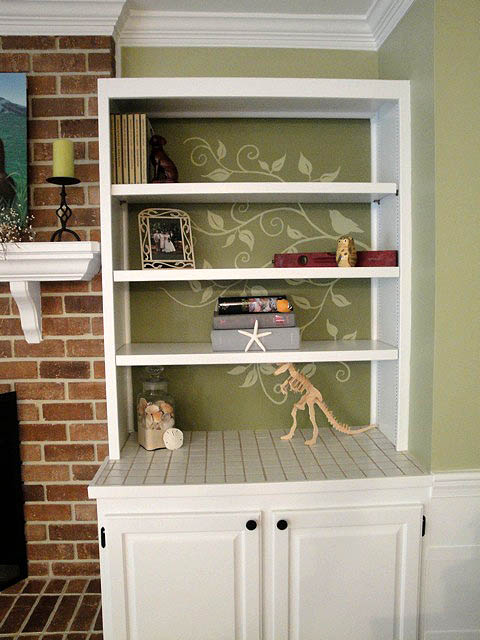
So, I admit it, I’m gaga for those silhouetted wall graphics. Some of my favorites are from Leen the Graphics Queen.
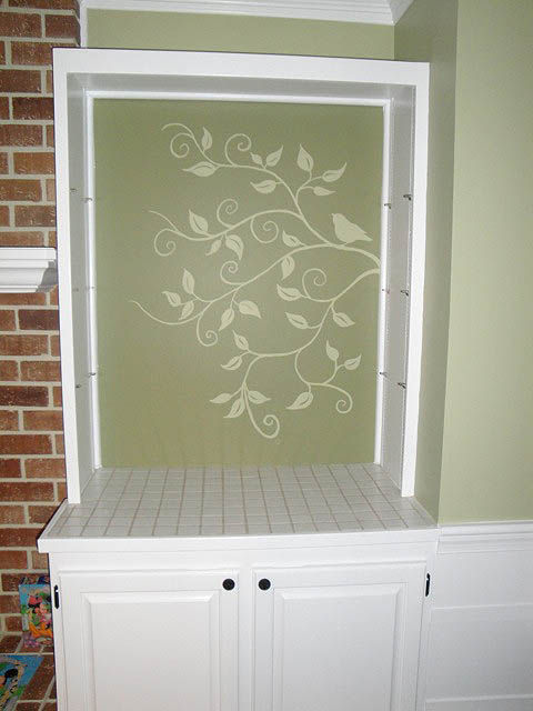
Because I have a background in illustration, I didn’t think twice about customizing the wall behind our bookcase with a design. If you have a super shaky hand, definitely stop here and head over to Leen’s!
If you are up for a challenge, keep reading. After clearing my built-in bookshelves, I started by lightly outlining where the bookshelves met the wall with pencil or chalk. Then I took out the bookshelves.
Next I used chalk to draw the outlines of my design. I was careful to avoid having a bird where the shelves would meet the wall.
Don’t think you can draw freehand? Try this trick (it works for enlarging a design also):
You can always print something you find online or make a copy of a design you see in print.
Legalese: Please be respectful of other’s artwork and
don’t try to sell anything you put the image on.
That is copyright infringement! Technically even copying the image from
someone else’s site or from a book is too. But, we’ll bend the law just this once.
You can take your print out and draw a grid across it (see above). Then draw your larger grid on the wall and focus on drawing one box in the grid at a time.
Now get your good brushes out. Make sure you have at least a small round brush with a good tip. And a flat brush will help too. A good brush really makes all the difference.
So, here is something I didn’t tell you yesterday. I actually left the dark pine green behind my bookshelves in the living room. So, when I used the lighter wasabi powder green it showed up lighter on the pine green. It is an optical illusion that the graphics are lighter than the rest of the room’s color.
After the paint dried I used a damp rag to remove the pencil and/or chalk marks. Then put the shelves back in.
See, no birdies were harmed during the creation of this wall treatment. By tracing the shelves from the start, I was able to ensure that the birds were not covered up by the shelves.
I love the whimsy that the graphics add, don’t you?
When I style my shelves, I TRY to keep it sparse.
And that was it! The cost was next to nothing since I used the same gallon of paint for the walls in the room (from yesterday.)
https://prettyhandygirl.com/wp-content/uploads/2010/08/finalbookcases.jpg388559Brittany Baileyhttps://prettyhandygirl.com/wp-content/uploads/2021/07/PHG-logo-tagline-2020-1030x211-R.jpgBrittany Bailey2010-08-19 19:47:002021-08-23 19:27:10Painting Decorative Graphics on a Wall