An Interview with David Bromstad – HGTV Color Splash Host
If I had to choose one HGTV host that I would like to meet in person, that would be a no-brainer. David Bromstad has always been my favorite designer with the transformation talent. With his “push the color envelope” attitude and ever present jovial (and often joking) nature, I think he’d be a blast to meet at a party or maybe collaborate on a DIY project for charity! (A handy girl can dream, right?) The other thing that gains David extra gold stars on my list of celebrities I’d like to meet, is the fact that he’s an artist too.
I am in love with his short painting tutorials on Color Splash. He really knows how to empower others to try their hand at artistic expression.
You can imagine that I’d be super excited when I received an email asking if I wanted to interview David Bromstad. That email was replied to INSTANTLY! Of course I hoped it meant he was coming to Raleigh, NC and we’d have coffee together and chat. But, you know, that was a dream that didn’t happen this time. Instead, I interviewed David just before the holidays via a phone conversation.
Without further adoration and praise… I have with me (virtually) today: the one — the only — Color Splash host, David Bromstad! Jump on your couches, scream like the Beatles are playing at the Ed Sullivan theater and share my exuberance to have him on the blog today.
{If you want to listen to the phone interview, press the play button: [sc_embed_player fileurl=”https://prettyhandygirl.com/wp-content/uploads/audio/David_Bromstad_Interview.mp3″]}
Welcome, David! I hope you can stay for a few minutes because I have several questions for you, and so do my readers. In fact, I asked on Facebook if they could ask David Bromstad a question what would it be.
If you happened to see that post (which few seem to see any Facebook status updates lately {shaking my fist at Facebook right now}) and asked a question, you’ll want to stick around because David has answers to your most perplexing design questions.
PHG: First I’d like to thank you ahead of time for taking the time to talk to me on the phone. I’ve enjoyed watching Color Splash for years and really love that you show people how they too can create their own artwork. Kudos to you for breaking it down for the viewers. Also, your love of color and pushing the envelope has helped many of us move away from “builder beige” and the all white kitchen syndrome.
When working on a room design. What is a good place to start? Do you choose a wall color first? Rug, draperies, or other?
David: A lot of people, when they move into their new homes or start a new project they think “Let’s choose a wall color. YEAH!” Bad move. There’s literally tens of thousands of different colors out there to choose from. What you should be choosing is your most expensive piece of furniture — your bed, you couch, your kitchen. Where I start with my design in a room is measurements. Take measurements of the room and make sure they are fairly accurate. And then create a space plan. I actually do little cut outs with graph paper and just move them around the room to see how they fit the best. Once you have your layout done you can look into purchasing furniture, the rugs, the lighting, the chair and then everything else like the accessories. Choosing the wall color should come absolutely 100% last.
PHG: Any ideas for using the new Pantone 2014 color of the year, which is Radiant Orchid?
David: I love radiant orchid and I think it’s a very nice and very current color. It’s nice that it’s a little more grayed out and more subdued than what we’ve had in the last few years. The color is really picked on how our economy is doing. If the economy is really sucking then the colors are going to be bright and vibrant to get everyone into a joyous spirit.
I like the color. I don’t think it’s a super useful wall color, it’s a great accent color. But, if you added a little bit of gray and a little bit of white — BAM — wall color. Gorgeous. Shades of that, stunning.
PHG: And now for some of those questions from my Facebook friends. “Any tips on picking a rug out of the MILLION choices out there?”
David: When you are choosing a rug, it should be larger than the largest piece of furniture that you have going into the space. So, if you’re using a couch that’s going to be 8 feet wide. You should have an 8’ x 10’ rug, so you have some overlap. My biggest pet peeve is when you have a rug and it’s floating in the middle of the room. And it’s a 5×7, the couch is 8 foot long and things aren’t touching. The rug should be under each piece of furniture, at least by 2 inches.
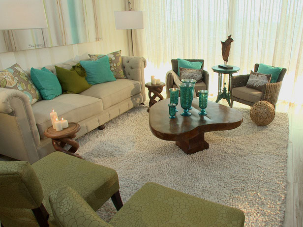
Color Splash episode photo courtesy of HGTV.com
PHG: That’s some great advice. Here’s another question from a reader: “How do I lose my fear of color?”
David: Losing your fear of color is pretty simple. I’m sure she has a tan beige wall, very neutral everything. Go to ZGallerie or GrandinRoad.com or go somewhere and grab a few throw pillows that are colorful (maybe they look a little scary to you, but you like the color) just grab them. Grab a bunch of them, go throw them on your couch. Throw pillows are the easiest way because you can bring them into your bedroom or your living room. And they are so usable. So, you just have to start slowly. Once you get involved with your throw pillows, then you can go back to the same store and buy some accessories that are the same color and spread them around the room. A piece of art is a great way to introduce color into the space without being too garish either. I love color! Love it, Live it! Everyday. But, the walls in my house are white. It offers the opportunity to change color much more frequently.
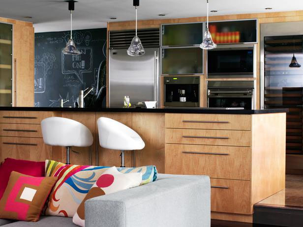
David’s Living Room/Kitchen courtesy of HGTV.com
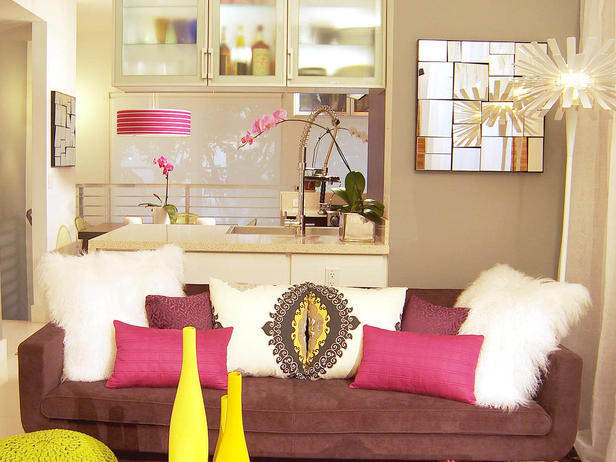
Color Splash episode photo courtesy of HGTV.com
PHG: Another reader asks, “If your entire home needed to be updated, but you could only choose one room to start with, which one would you choose?”
David: It depends on your budget. The kitchen is always a great way to increase the value of your home. But, it’s also very expensive (lots of labor, lots of time and lots of money.) Besides the kitchens (or the bathrooms) or things that are very functional, I’d have to choose my couch because I literally live on it all the time. Love it, I’m a big couch potato. I watch TV all the time. That’s where me, my dogs and my partner snuggle. So, it’s a big part of my life.

photo courtesy of David Bromstad’s Instagram feed
PHG: This is another great reader question that I’m curious about myself! “Can you mix wood tones (i.e. furniture) in a room and make it still look ok?”
David: Mixing wood tones is a necessary thing. Being too matchy matchy — eww. Matching wood tones means it looks like it came from a set. You know when you have a dark wood something with a light wood something it shows that you have design aesthetic and a design personality. But don’t forget with your woods you need your metals; with your metals you need your glass; with your glass you need your fluffy. With your fluffy you need your hard. All of these different things have to come together. So, mixing your wood tones is encouraged!
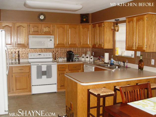
PHG: Another reader who needs some really good design advice. “Help! What can I do to fix color issues in my kitchen: I have maple glazed cabinets-look peachy and a gold tiled backsplash.”
David: Ooooh, poor thing. It all depends what she likes more. Does she like the gold backsplash or does she like the cabinets. Changing the cabinets whether you redo them, paint them, refinish them or whatever is still going to cost a lot of money and a lot of labor. So, there’s really no easy fix for her. But, having a gold backsplash can be awesome. Gold is big right now, but does she mean gold metallic or gold color? If she means gold color then I feel even more sorry for her. I think the easiest thing for her to do is refinish the cabinets. But, I’d do both [the backsplash and the cabinets]. While you’re in the midst of it. If it is gold metallic, paint your cabinets green.
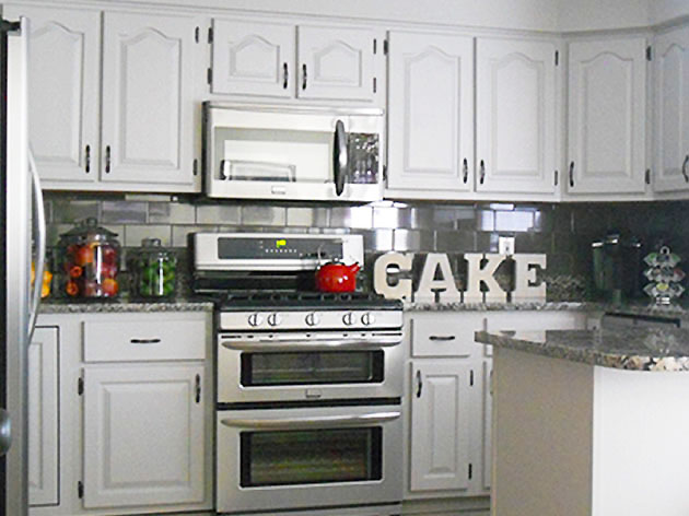
*Psssst. Both David and I think you need a whole new kitchen ;-). Here’s a great before and after I found from Mrs. Shayne.com who had a similar kitchen dilemma.
See how she painted her peachy cabinets and installed a new tile backsplash. It took her kitchen from ugly to WOW!
PHG: I love asking people to tell me what they were like as a child. Is there any story from your childhood that was a tell-tale sign of who you are today (the TV Host, Artist, Designer, etc.)
David: There are a few. But, for one I was always drawing or painting and coloring. That’s all I really did. I played with cars and toys, and played outside. But when I was inside I drew and painted. I had tons of coloring books. I just thought that other kids were like that because when all my friends came over that’s all we did. We either played outside or we colored. Now I realize not everyone did that.
Another tell tale sign that I was meant to be on television was when my first nephew was born and I was eleven, my Dad had a VCR camera (one of those big giant ones). It was at Christmas and he was taking all these videos of the little one. And I’m literally dancing in front of the camera saying, “Look at me! Look at me! I’m taking my jacket I’m waving it around. Look at me.” I would not let him focus on my little nephew, which was just hilarious because looking back — I guess I liked the camera back then. But, we didn’t even think about it because we grew up in a tiny town. It wasn’t really something you’d think about your son being on television.
Those were the two most tell tale signs looking in hindsight.
PHG: Do you have any behind the scene tales of a design fail or disaster (it can be one that was averted with quick thinking or a creative solution.)
David: During the 1st or 2nd season of Color Splash, my design assistant, Danielle, and I were picking out colors. We usually did it literally the day of the makeover. Like I said, I always pick out my paint color last because you never know what color accessories you’re going to get, your couch, all the other things that will factor. So, we are picking out the color at 6 o’clock in the morning in the San Francisco light. The colors were beiges and browns that we picked out. We got the beige color on the wall and it looked like flesh — super pinky. It looked literally like I peeled my flesh off, it was so Hannibal Lecter. Back then we had such an extreme budget, that we couldn’t buy more paint. It just wasn’t an option. So we took the brown paint and painted the entire room. That was probably one of the biggest quick fix disasters I’ve ever had.
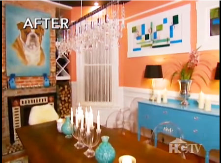
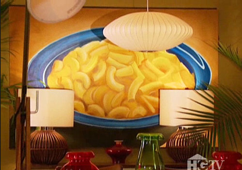
PHG: When you design a room you usually leave a one-of-a-kind painting behind. Do you have a favorite one that you painted?
David: I have probably two favorite ones. They were both in San Francisco. Petunia, the english bulldog,
and the Mac & Cheese painting.
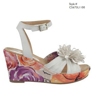
PHG: I see you have a new collaboration with Naturalizer. Wow, that’s an interesting collaboration. Can you tell me a little more? Will we see orginal David Bromstad paintings peeking out from beneath trouser hemlines?
David: Naturalizer wanted to do a collaboration with another designer and they realized that the HGTV clientele was very much in tune with the Naturalizer brand. I tend to have a little bit younger and hipper clientele than the Naturalizer brand has right now. They wanted me to do an original painting where they would take the painting and turn it into a print on a shoe and handbags. The summer collection comes out in March and I am working on the fall collection as we speak. This is going to take the Naturalizer brand and make it more young and hip and cool, but always comfortable!
PHG: Thank you so much for your time!
By the way, Mindy Potts, I shared your comment with him and he sends you his love and thanks at the end of the interview.
Mindy Hoole Potts I’m not sure I would ask him anything(too many good questions) maybe just thank him for being him and being on tv to inspire all of us HGTV lovers! Not sure he hears how much his designs help us to be brave and try color in our rooms too!
Be sure to listen to the whole interview if you get a chance. David is such a fun person and we had some laughs that I edited out of the written transcription: [sc_embed_player fileurl=”https://prettyhandygirl.com/wp-content/uploads/audio/David_Bromstad_Interview.mp3″]
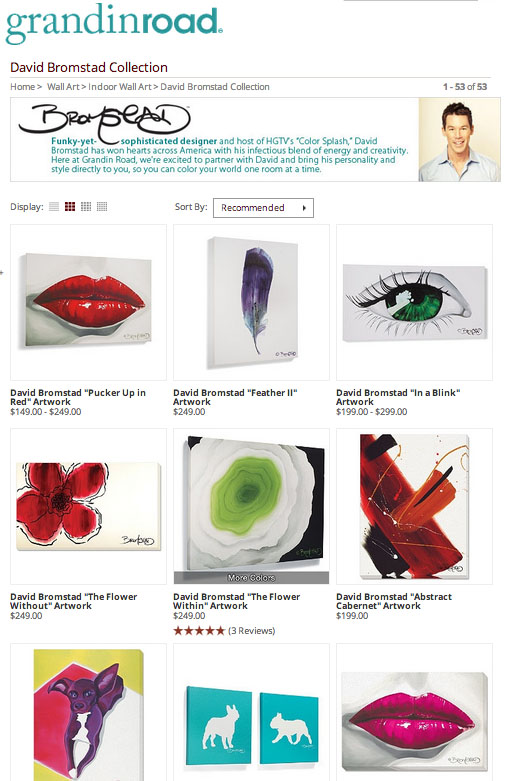
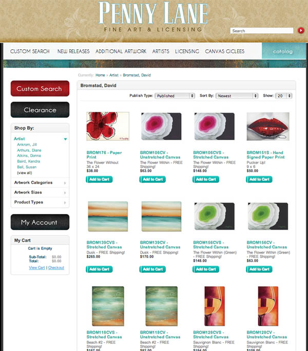
For all of those Facebook friends who wanted David to send you a painting, I have the next best thing! You can purchase one of David’s prints via:
or from:
And be sure to check out David’s Naturalizer collection!
And if you are a David Bromstad fan as well, check out his blog.
Or follow him on: Pinterest, Facebook, Instagram & Twitter!




I have always loved him!! He has such an amazing eye and use of color!! What an honor for you…. so awesome!! Thank you for sharing the audio version of your interview!! Love!!!
David Bromstad is very talented. Nice work on getting the interview!
Thanks Tamara. Love David! And I was stoked to talk to him.
Congrats on the interview, Brittany! You asked such great questions and I really learned a lot!
I loved the interview. So excited you got to do it and share it with us. Thanks David and PHG.
Thanks Erin. Isn’t he fun?!!!
I love David Bromstad! I was off of FB for a bit so I missed the post asking for questions. 🙁 Great interview and thanx for sharing!
Thanks Lisa. Glad you enjoyed the interview.