Tips for Choosing Paint Colors in the School Library
Choosing paint colors can be a daunting task. Looking at small paint chips at your local Lowe’s Home Improvement store can be a bit overwhelming. Especially because there are so many colors to choose from! (That can be a good thing too ;-).)
Luckily I have two tips to help you choose the paint color that’s right for you:
1. Use Valspar paint. Finding a paint color you love is easier with Valspar. If you don’t love the first color you choose, you can have another on them. It’s as easy as, love your color, or change your color. That’s the Valspar Love Your Color Guarantee. And it certainly helps alleviate the stress of choosing the right paint color for your room.
2. Create larger paint chips. Looking at tiny paint chips won’t help you conceptualize that color over the entire wall. Making large paint swatches using foam board and sample paints is easy and can save you time when choosing the ideal paint color. I put together this short video to show you how we selected the final color for the school library.
I knew if I could create big paint chips and let the librarian live with the large chips for a few days, she’d be better prepared to make a final decision. As you saw, she was much more comfortable choosing this way.
The winning color was Montpelier Wedgewood by Valspar. And, luckily after we began painting, we all fell in love with the color she chose.
Here’s how we tackled painting the school library (acoustic ceiling tiles and all!):
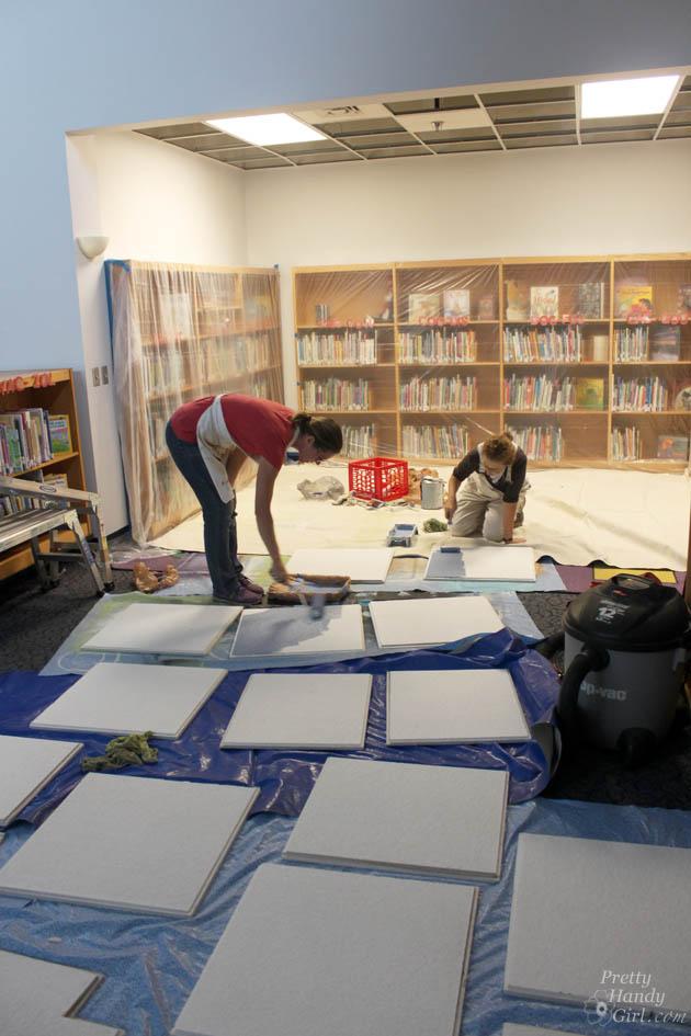
Before removing the ceiling tiles, we created a map of the tiles on a sheet of paper and numbered each square. Then we marked the number on the back of each tile as we took them down (team work really helped with this task.) Why the map and numbering? It made it easier when it came time to re-install them (especially if some were cut to fit.)
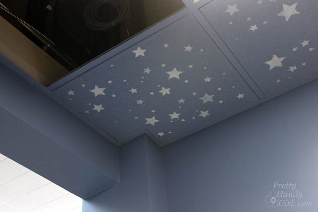
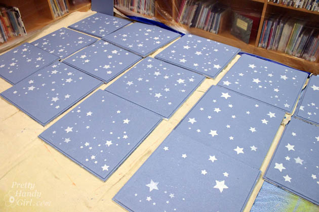
After removing the ceiling tiles, they were all wiped down with a wet rag. Then we used a medium nap roller to paint all the tiles. A paint brush was used to paint the sides as well. Then they were left to dry.
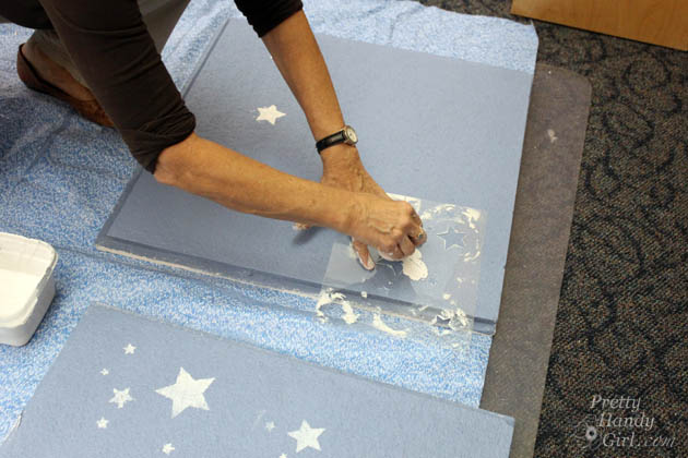
Meanwhile, I mixed a sample of white paint (mixed with some shimmering craft paint) to stencil the stars. I created a star stencil using my Silhouette cutter and a sheet of acetate, but you can also cut one by hand with an x-acto knife.
Luckily we had loads of volunteers to help stencil oodles of stars. Parents and children alike all chipped in to help.
By the end, I was seeing stars. LOL.
The ceiling tile grid had to be painted with a paint brush. This is where I was really glad that we bought the Valspar Paint & Primer in one paint. It definitely saved this project from being a literal pain in the neck.
The two tiles we couldn’t remove were painted and stenciled in place.
After the paint was completely dry, we returned them to their appropriate location. Thank goodness for the map!
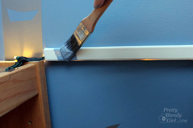
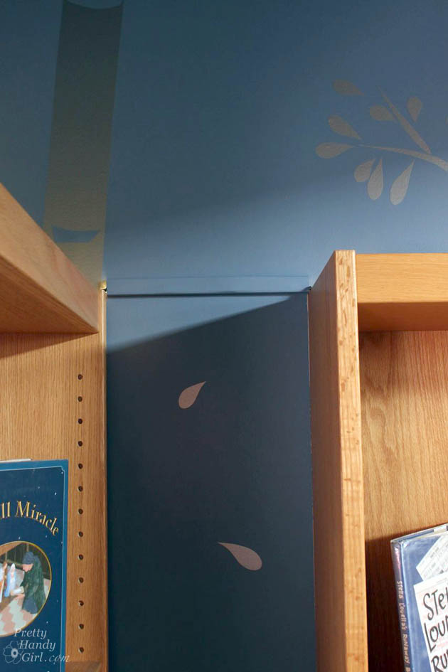
I put a fun surprise on top of all the bookcases, but I wanted to hide the cords. It was as simple as purchasing some adhesive cord covers at Lowe’s and painting them the same color as the wall.
See, much less noticeable now! Oooooo, sneak peek!
Next week I’ll show you how we added the final surprise elements to the library. In the meantime, is there a room you’ve been putting off painting? What do you think about choosing paint colors now that you know these tips. Ready to choose your color?
Disclosure: This is a sponsored post for Valspar Paint. I was compensated for my time writing this post. Valspar was also kind enough to donate the paint for the school library project. All ideas and words are my own.
(I’ve included affiliate links for your convenience. I earn a small percentage from a purchase using these links. There is no additional cost to you. You can read more about affiliate links here.)






am I missing something? The tutorial was supposed to be how to tile a floor, but I can”t get to it, I keep getting the library . Is there another link please?
Sorry the email link was wrong. Here’s the correct one: https://prettyhandygirl.com/tips-for-professional-looking-tile-floors/
Hello,
I’m working on 2 grants to redesign the interior of the library. It’s 3,800 sq. ft . The walls are all painted semi gloss white now. The windows are all close to the ceiling, I measured about 7 ft from the floor up. I need some color ideas. We are bringing in new furniture for the sitting area and the children’s room ,plus new carpet and tiling as well as painting the entire library, offices and all. We really want to bring this library into the 21 century.. Where can I get some ideas for the colors for my project.
I think you need to pick colors based off your furniture and rugs. You can browse Pinterest or Houzz for color inspiration.
Great post! Been reading a lot about tips for choosing the right paint colors. Thanks for the tips!
Awesome – thanks.
Yeah! Thanks so much. Can’t wait to try out the paint sample on my wall.
Fabulous Red (1011-2) is fabulous. It would be perfect for little pops of color all around our home!
someluckydog at gmail dot com
Antique Moss is a beautiful soothing green…makes me feel peaceful!
Blue Grass Mood (5006-6A) will leave you feeling anything but blue…! I love it.
I love the yellow chimes!
hazelnut coffee is a must; it is a nice warm toasted orange but not a pumpkin color. Very soothing and warm.
Congrats Bonnie! You won a paint sample from Valspar. Email me with your address and color selection.
So hard to pick, but I love Awakening!
Mulberry is my first choice. Overwhelmed by the blues and fgreens, I went with the purples. Really gorgeous palette from which to choose. I will use the Mulberry to paint the accent wall in my bedroom that cries out for redoing. Thanks for holding the give away, I love contests and colors.
Congrats Lynda! You won a paint sample from Valspar. Email me with your address and color selection.